The Tickiti interface
This article is a quick tour of the Tickiti screen so you know where to look for what. Throughout, the screenshots are taken from Sole Provider Inc, a fictional running-equipment supplier we use to illustrate the docs.
The full screen at a glance
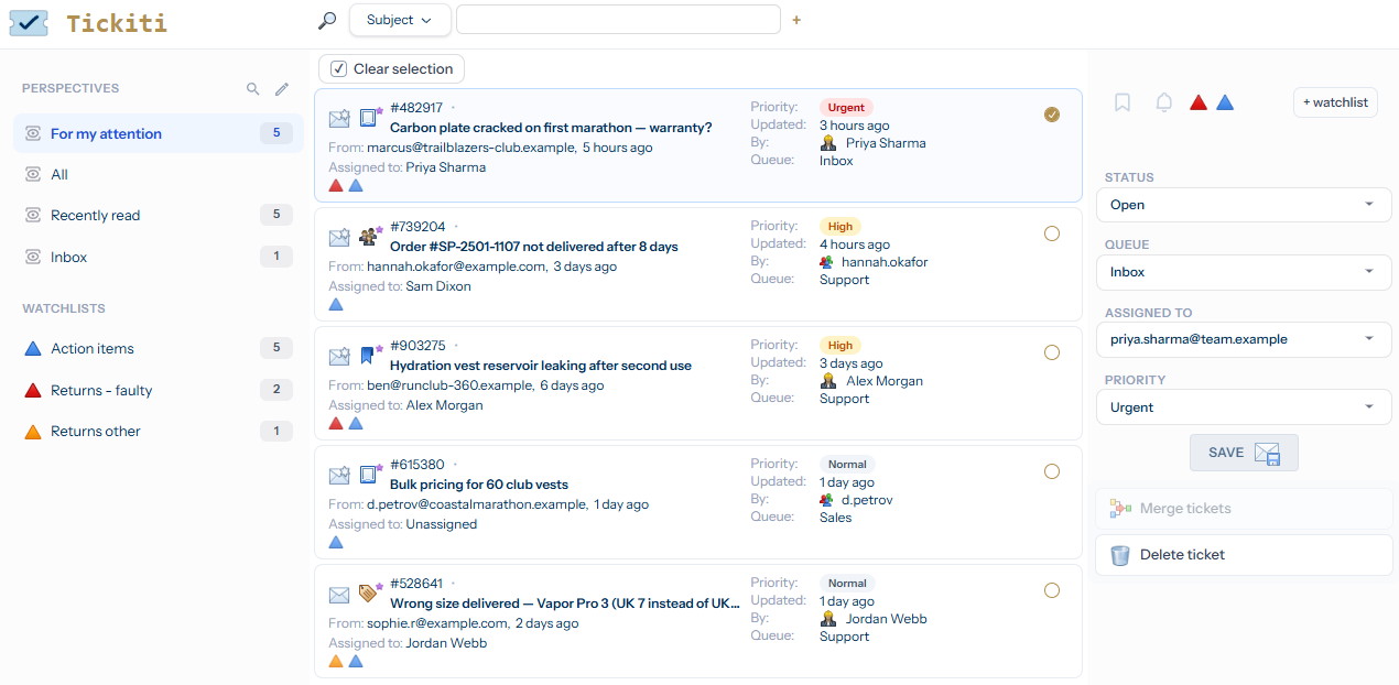
Tickiti has a small number of fixed regions. Once you know what each one does, the rest of the application is mostly variations on this layout.
Top-left — the Tickiti logo
The Tickiti logo at the top of the left-hand panel takes you back to the ticket browser from anywhere in the app. Think of it as the Home button.
Left — the Perspectives panel
The Perspectives panel lists the saved views you have access to. Each entry decides which tickets you see and the order they appear in. Click any name to switch to that view; the count badge on the right of each item tells you how many tickets currently match.
The two icons at the top of the panel — a magnifying glass and a pencil — let you find perspectives that are not in your panel and edit which perspectives you keep here. Using Perspectives covers this in detail.
Top-centre — the active perspective and search
The pill at the very top of the screen shows the active perspective — in the example, For my attention. Below that is the search bar: pick the field to search (Subject, From, etc.), type a term, and the ticket list filters in place. The + button to the right of the search box lets you add another search filter on top.
Centre — the ticket list
The middle column is the ticket list. Each card is one ticket and shows you, at a glance:
- The ticket number and subject.
- The priority badge — Urgent, High, Normal, etc.
- Who the ticket is from and how long ago it was last updated.
- Who it is assigned to and which queue it belongs to.
- Small icons that flag activity — unread responses, attachments, watchlists, and so on.
Click anywhere on a card (other than a control such as the checkbox) to open that ticket. Tick the circle on the right of a card to select it for a bulk action — you can select several at once and then act on them with the buttons at the top of the list.
Top-right — the new-ticket button
The envelope-with-plus icon in the top-right corner starts a new ticket. Creating tickets in the Staff Guide covers what each option means.
Right — the ticket detail pane
The right-hand area is the detail pane. When no ticket is selected it shows the placeholder “Click on any tile to view the ticket”. As soon as you open a ticket from the list, this is where the conversation, response composer and ticket controls appear. Your first ticket walks through using it end-to-end.
Bottom-left — connection status and the user menu
Below the perspectives panel is your connection status (you should see Connected in normal use — Tickiti uses a live websocket so updates appear without refreshing) and your user menu. Click your avatar to access settings or sign out.
Tips
- Most counts and labels update in real time. If a number looks stale, refresh the browser — Tickiti will reconnect and reconcile.
- Mobile and narrow-window layouts collapse the side panels into menus. The same regions are still there.